The template-editor is where you will be creating your no code web application pages. Each of its aspects is covered below.
Grid
After opening a template, the template grid appears. It looks like a checkered sheet, as shown below:
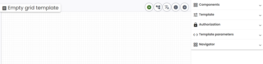
Initially, it will be empty. The grid serves to facilitate all your template’s no code UI components.
Style
You can adjust the grid size and color. This is explained in the Template style article.
Origin
The origin of the grid is located in the top left corner. The x-axis runs horizontally from left to right and the y-axis runs vertically from top to bottom. This information could be useful when positioning a component with the Position styling option. Again we refer to the Template style article for more information.
Drag and drop
You can drag and drop components from the component picker onto the grid, in the desired location.
Move
Move components that are already on the grid by clicking the move icon and dragging the component to the desired location. This icon can be seen below:
Resize
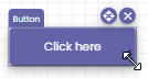
Resize components by clicking the three lines shaped like an arrow in the bottom right of the component. Drag your cursor around to resize. This is shown for a button component in the image below.
Delete
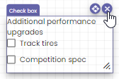
Delete components by clicking the cross in the top right corner of the component:
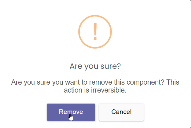
A window appears. Confirm the deletion by clicking the Remove button, or cancel it:
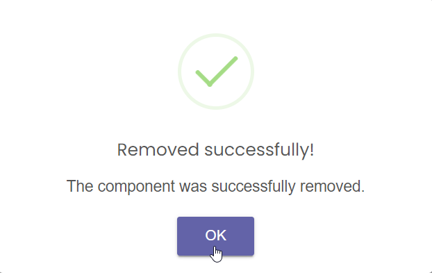
Then click OK in the success window:
Panning
Click anywhere on the grid and drag your cursor around to change your view of the template.
Zoom in/out
You can zoom in and on the grid by using the zoom bar in the bottom right corner of the grid. It looks like this:
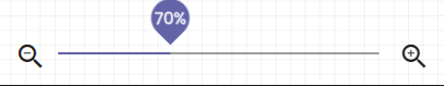
Click the left and right magnifying glasses or drag the slider in the middle to zoom in and out.
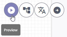
Preview
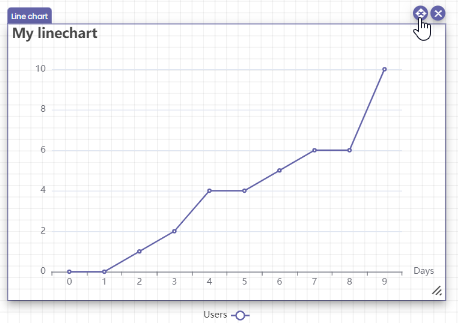
You can preview the webpage generated by the template by clicking the preview button in the top right corner of the grid. This is how the webpage will look for people accessing it through their browser.
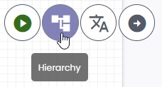
Hierarchy
Templates can inherit from other templates. This means that certain components will carry over to others, depending on their place in the template hierarchy. More details can be found in the Template hierarchy article.
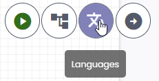
Translate
Often you will need your webpages to be available in multiple languages. NoCode-X supports this out-of-the-box. More details can be found in the Multilanguage article.
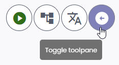
Toolbar
The toolbar is where you can find and configure components. You can also edit the information and style of the template. Open the toolbar by pressing the Toggle toolplane icon button in the top right corner of the grid:
The toolbar appears on the right of your screen:
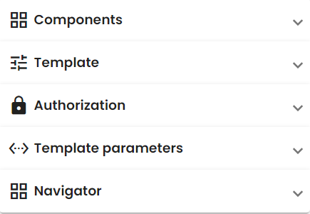
Click each tab to open it.
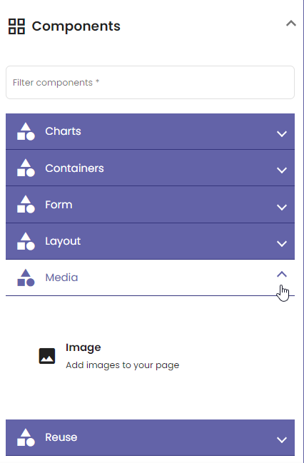
Components
Here you can search for components and view a short description for each. More details can be found in the Component picker article.
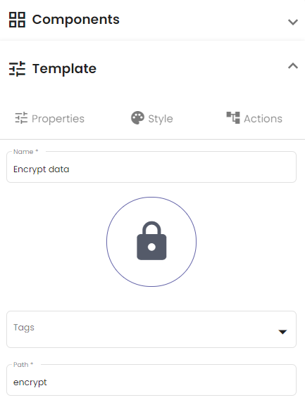
Template
Templates have properties, can be styled and can have actions attached to them. More details for each of the three tabs in the Template menu can be found in the Template properties, Template style and Template actions articles.
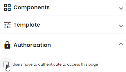
Authorization
You can configure who can access your page in the Authorization tab. Detailed information can be found in the template Authorization article.
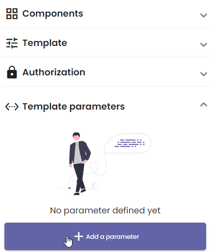
Template parameters
You can add variable elements on a template using Template parameters. A detailed explanation can be found in the Template parameters article.
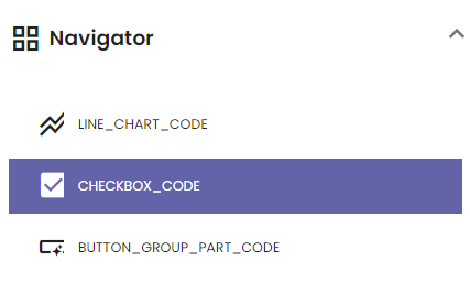
Navigator
The navigator shows the codes and the icon of all components currently on the grid. This allows you to easily select components that may otherwise be hard to locate on the grid.