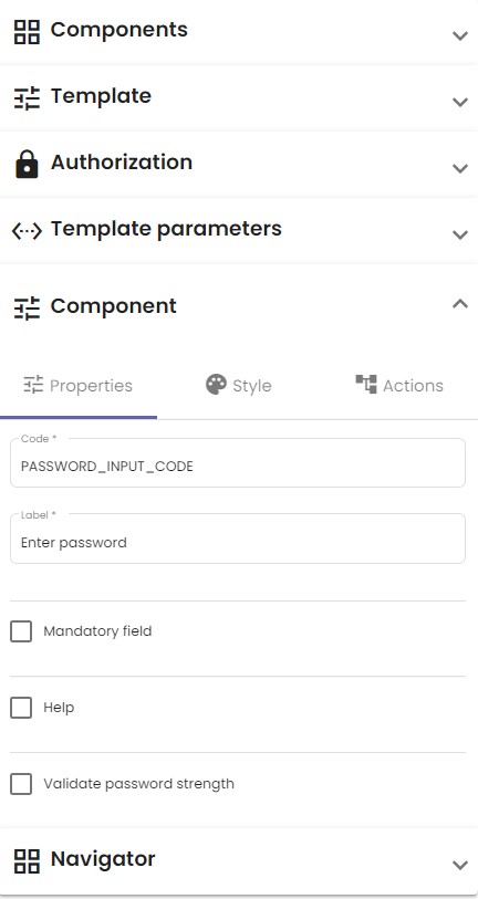
When a component is selected, a new drop-down menu Component appears on the right of your screen. Click it to change the properties of a component. As an example, the image at the bottom of this article shows the Properties tab for the Password component. The properties of a component depend on its nature.
Common component properties
Here are some common properties:
| Property | Description |
| Code | This mandatory field serves as an identifier for the component. It is invisible to users. A list of all components with their respective codes can be found in the Navigator tab. Make sure to use descriptive codes. For example, a date picker for birthdays could have the code DATE_BIRTHDAY. |
| Title | Charts usually have a title describing what data they represent. This property is visible on the template. |
| Label | Input fields that the user interacts with often have descriptions of what data the user must provide inside the input box. This property is visible on the template. |
Details about each component’s specific properties can be found on the All no code UI components page.
Example
The image below shows the Properties tab for the Password component.

