Contents
Form:
- Selection box
- Date
- File uploader
- Number
- Password
- URL
- Color choice
- Slider
- Icon button
- Button
- Chips input field
- Radio button
- Text field
- Check box
- Input field
Charts
Pie chart
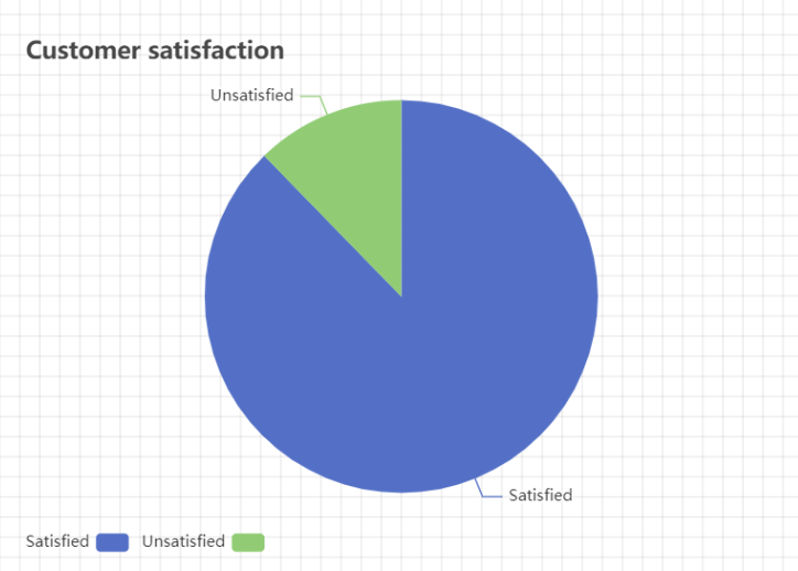
Description
Creates a pie chart from a given set of data. Includes a title and a legend, as well as labels for each slice.
Properties
| Title | Provide the title that will be displayed in the top left corner of this component. |
| Slices | A pie chart is made up of slices. Each slice can be given a name and a value. The value represents the portion of the pie the slice takes up. For example, if there are four slices with the value 25 and no others, each slice will take up a quarter (25/100) of the pie. |
Style
| Legend | – Visible: choose whether the legend should be visible or not. – Orientation: choose the orientation of the legend’s entries: vertical or horizontal. With vertical, the entries of the legend will be in a vertical line; with horizontal, they will be placed next to each other horizontally. – Left: alters the horizontal positioning of the entire legend. Choose between left, center, right and auto. – Top: alters the vertical positioning of the entire legend. Choose between top, middle, bottom and auto. |
| Datasets | Pick the color for each slice. |
Radar
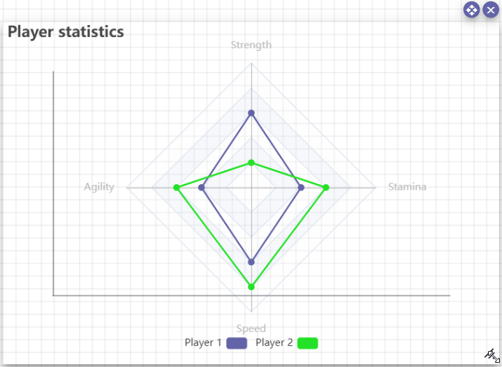
Description
Creates a radar chart from a given set of data. Includes a legend, as well as labels for each dataset.
Properties
| Title | Provide the title that will be displayed in the top left corner of this component. |
| X-axis | Choose the indicators for the X-axis. Must be separated by semicolons ( ; ). |
| Datasets | Add datasets for this chart. Every dataset has a name and a series of values. Values must be separated by semicolons ( ; ). |
Style
| Legend | – Visible: choose whether the legend should be visible or not. – Orientation: choose the orientation of the legend’s entries: vertical or horizontal. With vertical, the entries of the legend will be in a vertical line; with horizontal, they will be placed next to each other horizontally. – Left: alters the horizontal positioning of the entire legend. Choose between left, center, right and auto. – Top: alters the vertical positioning of the entire legend. Choose between top, middle, bottom and auto. |
| Datasets | Pick the color for each dataset. |
Bar chart
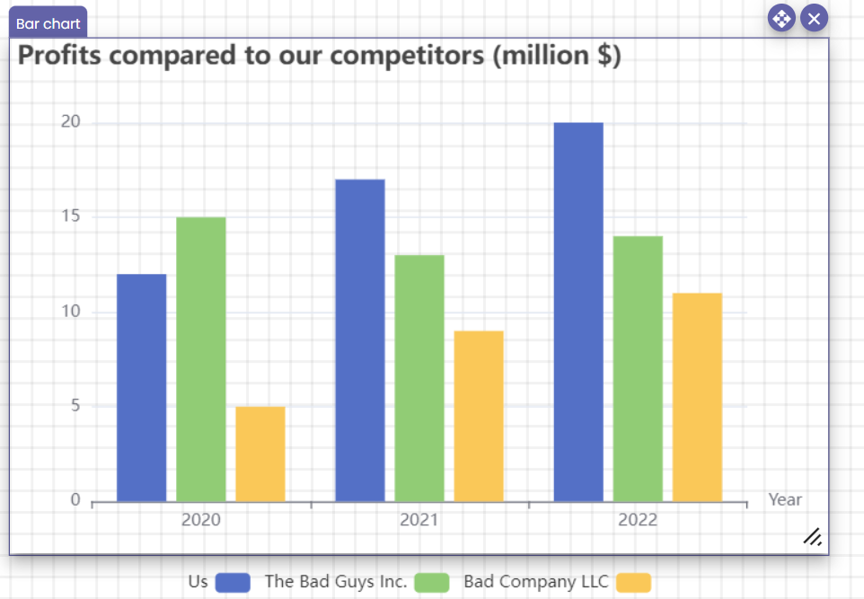
Description
Creates a bar chart from a given set of data. Includes a title, a legend, a label for the x-axis and automatic numbering of the y-axis.
Properties
| Title | Provide the title that will be displayed in the top left corner of this component. |
| X-axis | – Name: the name of this axis, appears after its endpoint on the right. – Values: text that appears right below the x-axis, in the center. |
| Datasets | A bar chart is made up of vertical bars of a certain length. Each set of bars has a name and multiple value. The values will be displayed on the y-axis (vertical). They must be separated by semicolons ( ; ). |
Style
| Legend | – Visible: choose whether the legend should be visible or not. – Orientation: choose the orientation of the legend’s entries: vertical or horizontal. With vertical, the entries of the legend will be in a vertical line; with horizontal they will be placed next to each other horizontally. – Left: alters the horizontal positioning of the entire legend. Choose between left, center, right and auto. – Top: alters the vertical positioning of the entire legend. Choose between top, middle, bottom and auto. |
| Datasets | Pick the color for each bar. |
Line graph
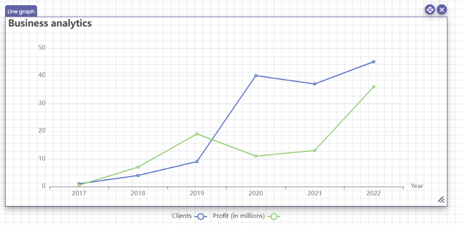
Description
Creates a line graph. Each graph consists of one or more data points with a value on the x-axis and on the y-axis. Multiple lines can be placed on the same graph.
Properties
| Title | Provide the title that will be displayed in the top left corner of this component. |
| X as | – Name: the name of the x-axis. appears to the right of this axis. – Values: The values shown on the x-axis. Must be separated by semicolons ( ; ). |
| Datasets | The different lines on the graph. – Name: The name of this line. Will be shown in the legend, along with its color. – Values: The y-values of this line. Must be separated by semicolons ( ; ). |
Style
| Legend | – Visible: choose whether the legend should be visible or not. – Orientation: choose the orientation of the legend’s entries: vertical or horizontal. With vertical, the entries of the legend will be in a vertical line; with horizontal, they will be placed next to each other horizontally. – Left: alters the horizontal positioning of the entire legend. Choose between left, center, right and auto. – Top: alters the vertical positioning of the entire legend. Choose between top, middle, bottom and auto. |
| Dataseries | Pick the color for each line. |
Containers
Components inside of containers will inherit the styling settings of their container. For example, if you set a certain font in the container’s styling menu and then add a title component to the container, it will get the same font (unless the title already has a different font configured).
Plane
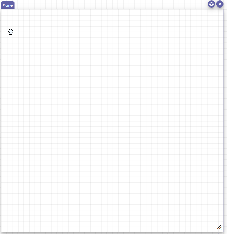
Description
A simple surface where you can accommodate components. All components placed inside of it will stay in their chosen positions and move along with the plane.
Properties
| Code | Programmatic reference to this component. More information can be found on the Component properties page. |
Style
- Size and position
- Style: Normal, On hover
See the standard styling options for detailed information.
Tabs
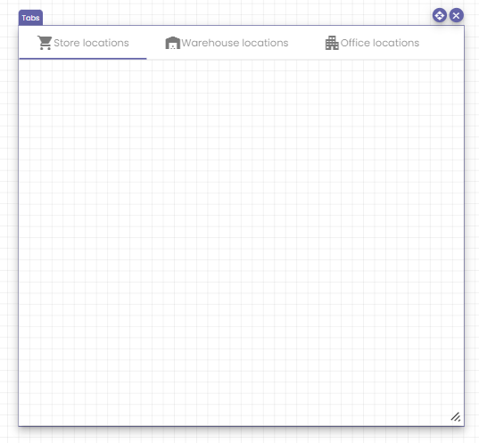
Description
Organize your components in different tabs to create a well-organized page.
Properties
| Code | Programmatic reference to this component. More information can be found on the Component properties page. |
| Tabs | Add tabs by pressing the Add tabs button. Each tab has a name and optionally an icon. |
Style
- Size and position
- Style: Normal, On hover
See the standard styling options for detailed information.
Stepper
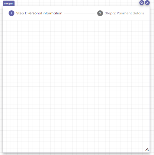
Description
Divide your component into successive steps and offer them to your users in order.
Properties
| Code | Programmatic reference to this component. More information can be found on the Component properties page. |
| Steps | Add steps by pressing the Add steps button. Each step has a name and optionally an icon. |
Style
- Size and position
- Style: Normal, On hover
See the standard styling options for detailed information.
Vertical list
Description
Visualize components in a vertical list. Add components by dragging them into this component.
Properties
| Code | Programmatic reference to this component. More information can be found on the Component properties page. |
Style
Special option:
| Items | – Gap: change the distance between the components in this vertical list. |
Standard options:
- Size and position
- Style: Normal, On hover
See the standard styling options for detailed information.
Horizontal list
Description
Visualize components in a horizontal list.
Properties
| Code | Programmatic reference to this component. More information can be found on the Component properties page. |
Style
Special option:
| Items | – Gap: change the distance between the components in this vertical list. |
Standard options:
- Size and position
- Style: Normal, On hover
See the standard styling options for detailed information.
Form
To set a default value for a form component, see the relevant section in the Components article.
Selection box
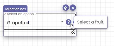
Description
Allows the user to select an option from a drop-down list. Assisted with auto complete functionality.
Properties
| Code | Programmatic reference to this component. More information can be found on the Component properties page. |
| Label | The label will be displayed inside the selection box when no choice has been selected yet. |
| Choices | Add a choice by pressing the Add button. Each choice has a label and an optional help message. |
| Add empty choice | Adds an empty choice to the list of choices. |
| Mandatory field | Makes the field mandatory. Type a mandatory validation message. |
| Help | Optional help message. |
Style
- Size and position
- Style: Normal, On hover, On focus
See the standard styling options for detailed information.
Actions
Actions can be performed on change.
Date
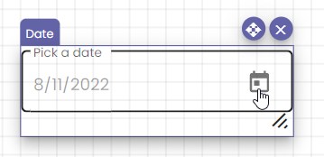
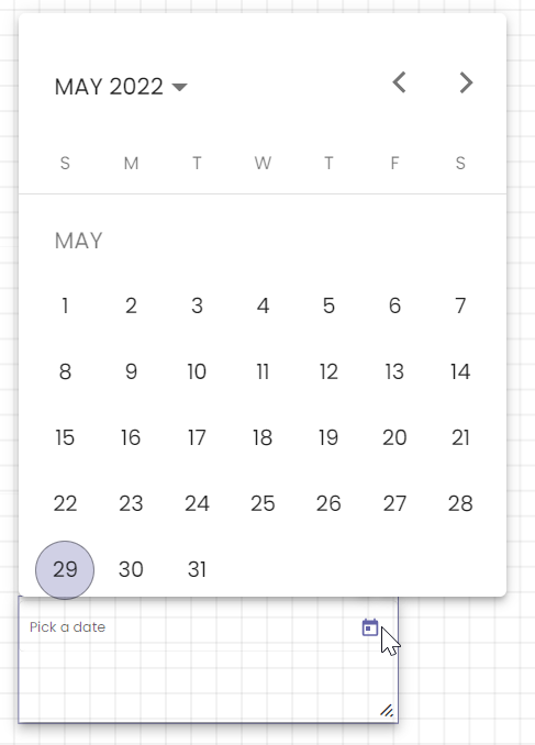
Description
Allows the user to pick a date, optionally within a given date interval.
Properties
| Code | Programmatic reference to this component. More information can be found on the Component properties page. |
| Label | The label will appear inside the date field when no date has been selected yet. |
| Maximum date | The latest possible date that can be selected by the user. This is optional. |
| Minimum date | The earliest possible date that can be selected by the user. This is optional. |
| Mandatory field | Makes the field mandatory. Type a mandatory validation message. |
| Help | Optional help message. |
Style
- Size and position
- Style: Normal, On hover, On focus
See the standard styling options for detailed information.
Actions
Actions can be performed on change.
Linked function calls
File uploader
Description
Allows the user to upload a set amount of files to your media library, with restricted file types.
Properties
| Code | Programmatic reference to this component. More information can be found on the Component properties page. |
| Start upload | Message displayed when files are being uploaded. |
| Maximum number of uploads | Maximum amount of files that can be uploaded. |
| Maximum file size | Maximum size of each file in bytes. |
| Concurrent upload amount | Maximum amount of files that can be uploaded at once. |
| Allowed types | Allowed file types inside this uploader. You have to select at least one file type for the component to work. |
| Show dropzone | Displays a message inside the dropzone. This field is optional. |
| Show upload button | Displays a button with a chosen label to upload files, so files do not have to be drag-and-dropped. |
| Show pick file button | Displays a button in the language of the user’s computer to upload files, so files do not have to be drag-and-dropped. |
Style
- Size and position
- Style: Normal, On hover
See the standard styling options for detailed information.
Actions
Actions can be performed on upload.
Number
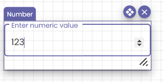
Description
Add a number input field to your page.
Properties
| Code | Programmatic reference to this component. More information can be found on the Component properties page. |
| Label | The label will appear in the number field when no number has been typed yet. |
| Mandatory field | Makes the field mandatory. Type a mandatory validation message. |
| Help | Optional help message. |
Style
- Size and position
- Style: Normal, On hover, On focus
See the standard styling options for detailed information.
Actions
Actions can be performed on change.
Linked function calls
Password
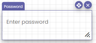
Description
Allows your users to securely enter a password using this password input field.
Be aware: the password is only obfuscated on the front end of the user, the information is readable on the client in the code!
The component discloses the length of the password being entered, but this is a trade off between user experience and information disclosure.
Properties
| Code | Programmatic reference to this component. More information can be found on the Component properties page. |
| Label | The label will appear in the password field when no password has been typed yet. |
| Mandatory field | Makes the field mandatory. Type a mandatory validation message. |
| Help | Optional help message. |
| Validate password strength | Specify certain conditions passwords must adhere to. This is recommended for increased security. |
Style
- Size and position
- Style: Normal, On hover, On focus
See the standard styling options for detailed information.
Actions
Actions can be performed on change.
Linked function calls
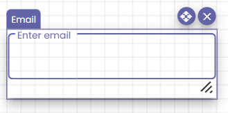
Description
Allow users to enter a correctly formatted e-mail address. This de facto requires a valid e-mail address entered when not empty.
Properties
| Code | Programmatic reference to this component. More information can be found on the Component properties page. |
| Label | The label will appear in the email when no email has been typed yet. |
| Invalid email validation message | This message displays when an invalid email has been entered. |
| Mandatory field | Makes the field mandatory. Type a mandatory validation message. |
| Help | Optional help message. |
Style
- Size and position
- Style: Normal, On hover, On focus
See the standard styling options for detailed information.
Actions
Actions can be performed on change.
Linked function calls
URL
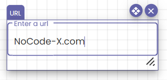
Description
Lets your users enter a validated URL in input field.
Properties
| Code | Programmatic reference to this component. More information can be found on the Component properties page. |
| Label | The label will appear in the URL field when no URL has been typed yet. |
| Invalid URL validation message | This message displays when an invalid URL has been entered. |
| Mandatory field | Makes the field mandatory. Type a mandatory validation message. |
| Help | Optional help message. |
Style
- Size and position
- Style: Normal, On hover, On focus
See the standard styling options for detailed information.
Actions
Actions can be performed on change.
Linked function calls
Color choice
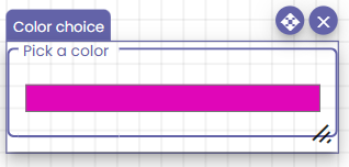
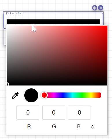
Description
Let your users choose a color from a color palette in a user-friendly way.
Available options:
- Extract a color from the screen
- Rainbow view
- RGB values [0, 255]
Properties
| Code | Programmatic reference to this component. More information can be found on the Component properties page. |
| Label | The label will appear above the selected color. |
| Mandatory field | Makes the field mandatory. Type a mandatory validation message. |
| Help | Optional help message. |
Style
- Size and position
- Style: Normal, On hover, On focus
See the standard styling options for detailed information.
Actions
Actions can be performed on change.
Slider
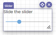
Description
Allow the user to select a number between a set interval using a slider.
Properties
| Code | Programmatic reference to this component. More information can be found on the Component properties page. |
| Label | The label will appear above the slider. |
| Minimum | The minimum value that can be selected with the slider. |
| Maximum | The maximum value that can be selected with the slider. |
| Step | The difference between two consecutive slider positions. Users cannot select an intermediary value. |
| Help | Optional help message. |
Style
- Size and position
- Style: Normal, On hover
See the standard styling options for detailed information.
Linked function calls
Icon button
Description
A button with only an icon.
Properties
| Code | Programmatic reference to this component. More information can be found on the Component properties page. |
| Icon | Select an icon for this button from the interactive menu. |
| Type | Perform actions on click or use this icon button to submit forms. The submit form type makes sure that the form is validated. If something does not validate, the underlying action linked to this icon button will not execute. |
Style
- Size and position
- Style: Normal, On hover
See the standard styling options for detailed information.
Actions
Actions can be performed on click.
Button
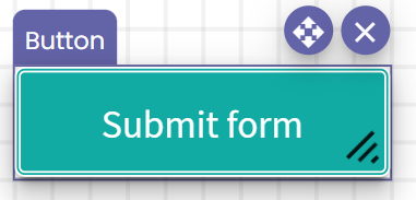
Description
Add a button to your page to which you can link all kinds of actions.
Properties
| Code | Programmatic reference to this component. More information can be found on the Component properties page. |
| Label | The label will appear on the button. |
| Type | Perform actions on click or use this button to submit forms. The submit form type makes sure that the form is validated. If something does not validate, the underlying action linked to this button will not execute. |
Style
- Size and position
- Style: Normal, On hover
See the standard styling options for detailed information.
Actions
Actions can be performed on change.
Chips input field
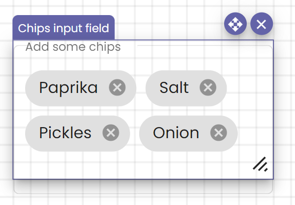
Description
Properties
| Code | Programmatic reference to this component. More information can be found on the Component properties page. |
| Label | The label will appear in the input field when no chips have been added yet. |
| Mandatory field | Makes the field mandatory. Type a mandatory validation message. |
| Help | Optional help message. |
Style
- Size and position
- Style: Normal, On hover, On focus
See the standard styling options for detailed information.
Actions
Actions can be performed on change.
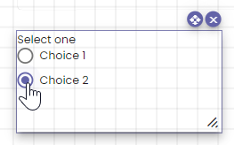
Radio button
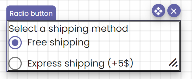
Description
Add a set of radio buttons with text.
Properties
| Code | Programmatic reference to this component. More information can be found on the Component properties page. |
| Label | The label will appear above the radio button(s). |
| Choices | Click the Add choice button to add a new choice. Every choice has a label and an optional help message. |
| Mandatory field | Makes the field mandatory. Type a mandatory validation message. |
| Help | Optional help message. |
When you want a default value to be selected, go to the template view and select the option.
Style
- Size and position
- Style: Normal, On hover, On focus
See the standard styling options for detailed information.
Actions
Actions can be performed on change.
Linked function calls
- Add choice to a radiobutton component
- Remove choice from a radiobutton component
- Get answer of radiobutton field
- Set answer of radiobutton field
- Get answer label of radiobutton field
Text field
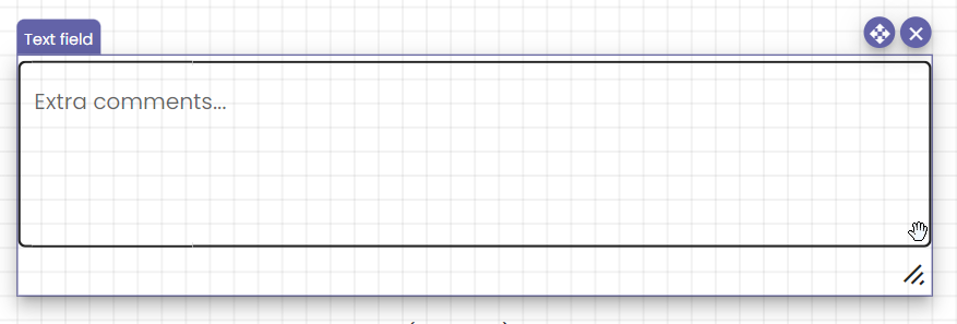
Description
Lets your users enter a larger chunk of text into this text box.
Properties
| Code | Programmatic reference to this component. More information can be found on the Component properties page. |
| Label | The label will appear in the text box when no text has been typed yet. |
| Mandatory | Makes the field mandatory. Type a mandatory validation message. |
| Help | Optional help message. |
Style
- Size and position
- Style: Normal, On hover, On focus
See the standard styling options for detailed information.
Actions
Actions can be performed on change.
Linked function calls
Check box
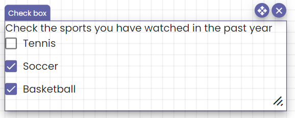
Description
Add a list of check boxes to your page. Users can check one or more options, as well as none (if the field is not mandatory).
Properties
| Code | Programmatic reference to this component. More information can be found on the Component properties page. |
| Label | The label will appear above the choice(s). |
| Choices | Click the Add choice button to add a new choice. Every choice has a label and an optional help message. |
| Mandatory field | Makes the field mandatory. Type a mandatory validation message. |
| Help | Optional help message. |
Style
- Size and position
- Style: Normal, On hover, On focus
See the standard styling options for detailed information.
Actions
Actions can be performed on change.
Linked function calls
- Add choice to a checkbox component
- Remove choice from a checkbox component
- Get answer of checkbox field
Input field
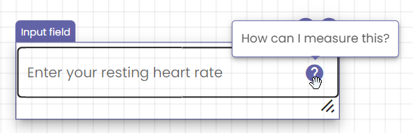
Description
Add a simple input field to your page.
Properties
| Code | Programmatic reference to this component. More information can be found on the Component properties page. |
| Label | The label will appear inside the input field when no text has been entered yet. |
| Mandatory field | Makes the field mandatory. Type a mandatory validation message. |
| Help | Optional help message. |
Style
- Size and position
- Style: Normal, On hover, On focus
See the standard styling options for detailed information.
Actions
Actions can be performed on change.
Linked function calls
Layout
Text
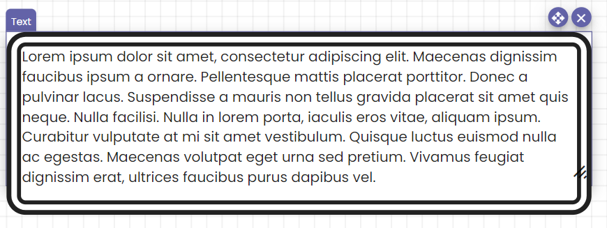
Description
Adds a block of text to your page.
Properties
| Code | Programmatic reference to this component. More information can be found on the Component properties page. |
| Text | The text that will be displayed inside this component. |
Style
- Size and position
- Style: Normal
See the standard styling options for detailed information.
Horizontal divider
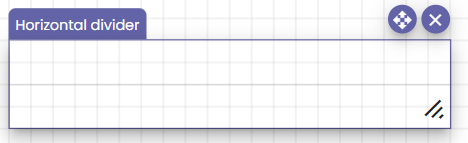
Description
Divides the screen into logical parts, using a horizontal line.
Vertical divider
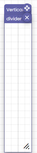
Description
Divides the screen into logical parts, using a vertical line.
Icon
Description
Place an icon on your page.
Properties
| Code | Programmatic reference to this component. More information can be found on the Component properties page. |
| Icon | Select the icon to be displayed using the interactive icon picker. |
Style
- Size and position
- Style: Normal, On hover
See the standard styling options for detailed information.
Link
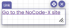
Description
Adds a URL to your page.
Properties
| Code | Programmatic reference to this component. More information can be found on the Component properties page. |
| Text | The link text. |
| URL | The URL the link should lead to. |
| Target | Choose whether the link should open in the current tab or in a new one. |
Style
- Size and position
- Style: Normal, On hover, On focus, When active
See the standard styling options for detailed information.
Title
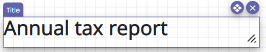
Description
Adds a title to your page.
Properties
| Code | Programmatic reference to this component. More information can be found on the Component properties page. |
| Title | The visible title on your application |
| Level | The heading formatting of your title. |
Style
- Size and position
- Style: Normal, On hover
See the standard styling options for detailed information.
Paging
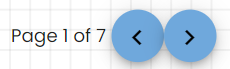
Description
Add a paging control to your page.
Properties
| Code | Programmatic reference to this component. More information can be found on the Component properties page. |
| Pages | The amount of pages. |
| Current page | The current page. |
| Page text | The text displayed right before the current page. |
| Of text | The text displayed between the current page and the total amount of pages. |
Style
- Size and position
- Style: Normal, On hover, On focus, When active
See the standard styling options for detailed information.
Media
Image
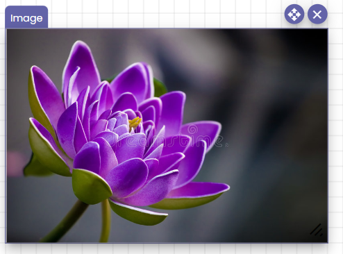
Description
Add images to your page.
Properties
| Code | Programmatic reference to this component. More information can be found on the Component properties page. |
| Image | Choose an image from the media library or from a specified URL. |
Style
- Size and position
- Style: Normal, On hover
See the standard styling options for detailed information.
Actions
Actions can be performed on click.
Reuse
Template
Description
Display a different template inside the current one.
Properties
| Code | Programmatic reference to this component. More information can be found on the Component properties page. |
| Select a template | Choose the template you want to display inside the current one. |